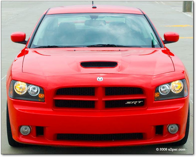
Well now lets get on to critiquing the new remix of the previous Dodge Charger – the all new 2011 Dodge Charger. The first sight of recognizable difference is at the front of the car. Here the front fascia of the car has a more raked-upward look. However, there are some displeasing aspects of this new redesign. The original shape of the headlamp housing was not retained in the new design. Instead, the headlamp housing is more rectangular-ish, in contrast to the previous design in which the top of the headlamp shape had a more striking upward slant. In addition, the headlamps have been pushed in further, giving a more drawn back or relaxed look to the front end. This is in contrast to the previous design, in which the headlamps were pushed further out, and almost in line with the grille. This positioning made for a bolder in-your-face look, and in combination with the grille and headlamp housing design, aided in an aggressive, ferocious cat appearance. Furthermore, the headlamps within the housing are too big, as well as too square-ish! The headlamps take up almost all of the space in the housing. It leaves no visual breathing space, so to speak. There always needs to be a little “air” in the headlamp housing so, you can appreciate its shape design – well if there’s anything nice about it to begin with. However, there is one positive aspect about the front end design of the new Dodge Charger, and it’s also one that I had predicted. They pulled in the sides of the grille – gave it a lower inward angle. This is a good progressive design update J . All that would have been needed to accompany this is raked – up headlamps, but at the same time, still retaining most of the former headlamp shape.
Ok, now lets move on to the side of the car. OMG! WTF! What happened here? Are you kidding me? No, holy crap, are you really kidding me? This just aint right! Say it aint so! They removed the crease that used to be on the rear shoulder! L This was a defining design aspect of the Dodge Charger. This is a famous crease! And the thing about it is that it wasn’t just any type of crease. It was a meticulous crease – like a little mixture of a Nike swoosh and a lightning bolt. It was banging! I'm going to go a little bit further, it was snatching! Whenever a Dodge Charger would pull up besides me on the street, I would stare endlessly at that striking rear shoulder panel crease. Also, another disappointment with the design of the side of the car, is the shape of the rear passenger window. The former design was more interesting, it added drama, and accented the fore mentioned crease on the rear quarter panel. Lastly, the rear end of the side of the car has a vertical profile compared to the previously slanted style. This re-design delays the look of visual movement on the car. On the previous Charger, both the front and rear end of the side profile was slanted, or leaning forward. This gave the car a look of motion. It had a leaping, or pouncing look. (When standing still, it looked like it was in transition). At present, however, the new Dodge Charger only has the front end of the side profile of the car slanted. Therefore, this has the effect of the front end of the car appearing like its moving while the rear end is at a standstill. This in combination, gives the car a stagnant profile – a look of no motion. But, however, there is one positive design aspect of the side of the car. It does have a large crease in the panel – albeit a different type. The only thing is that, it’s sort of a plane Jane indentation, and would probably be more complemented by the addition of the previous crease from the previous charger (on the rear quarter panel). I think that combination would be kickin’! It would be new, different and innovative – umm yeah, the way I came to think of Dodge after they first came out with that re-designed Dodge Charger. (lol)
Ok, well now, lets head on to the back of the car. The redesign of the rear of the car is awesome, I must say. It’s really decent! It’s tight! It’s neat! In fact, (hahaha) the rear end is my type of what I call good-‘ol bold innovative Dodge styling!
Now here comes the final grade. All in all, in regards to the improper front end re-design and in addition to the removal of the rear quarter panel crease, and the boring reshaping of the rear passenger window on the side, I’ll give the 2011 Dodge Charger a C. For me I am a crude street (SeraniTafari Street Team lol)critique of automobile styles. You either hot or you not. In my crude design vocabulary, good = hot, and ugly = not hot. But because I still have some love for Dodge (because of the hot stuff they have made before) and respect other lovers of Dodge, I won’t just outright say its ugly – and that would be a little bit ignorant, because there some good design additions to the car. So umm yeah J .
A designer must be observant..design is money! The Big Three have what it takes to be successful, and money is at stake..if you need help, holla at the SeraniTafari Street Team!
- Gebre Mesquitta


No comments:
Post a Comment